Welcome to Caked!
For my senior project, I’ll be creating a packaging and advertising campaign for the company Caked. This is an artistry makeup brand designed for those who unapologetically embrace bold, statement-making looks. This isn’t your typical “clean girl” makeup. Caked is a high-end artistry line that dares you to have your cake and wear it too.
I want to show that makeup is more than just covering up “blemishes.” Makeup should be indulgent, expressive, and unapologetically fun. The goal of this project is to embrace boldness and creativity, challenging the idea that it’s wrong to “cake on makeup.” This brand rejects the stigma that “people look ugly without makeup” or that makeup is only for hiding blemishes. Instead, Caked celebrates makeup as an art form and a tool for self-expression.
According to YouGov, 63% of U.S. adult men believe women wear makeup primarily to “trick people” into thinking they’re more attractive. Similarly, 43% of U.S. adults think people wear too much makeup. Caked. aims to transcend these beliefs and challenge the standards of beauty. The target demographic for this project is late Gen Alpha to early Millennials (ages 13–35).
While older generations might also appreciate this brand, younger generations are redefining who uses makeup and how it is used. For example, an Ipsos study revealed a generational divide, 73% of men aged 51 and older are unwilling to consider using cosmetics, compared to just 37% of men aged 18–34. This shows a growing acceptance of makeup as a form of self-expression, not confined by gender or traditional roles.
My goal is to design makeup that is bold, fun, and barrier breaking brand that redefines what makeup can mean for everyone.
The deliverables for this project includes:
-
Logo
-
Packaging
-
Eyeshadow Palette
-
Lipstick/Box
-
Foundation/Box
-
Setting Powder
-
-
Advertising
-
Magazine Ads
-
Billboard
-
Instore Display
-
-
Microsite
Objectives/Brand Overview
Objectives
-
To independently research, design and produce a logo, Makeup Packaging, magazine ads, Billboard, Instore Display and a microsite homepage for my makeup brand Caked.
-
To thoroughly research makeup and cakes/bakeries to incorporate into the design of each component of the project.
-
To apply knowledge that was taught in past classes such as branding, typography, illustration, and photography to my project.
-
To critique myself and actively seek out critique from faculty/peers to improve my senior project.
-
To develop the identity of Caked (Indulgence in every step) and make cohesive branding across all aspects of the project with excellent design and craftsmanship.
-
To produce and excellently craft the physical elements for the brand.
Brand Overview
Caked is a theoretical makeup brand founded in 2002 that is known for their over-the-top makeup. Caked celebrates makeup as an art form and a tool for self-expression. It is a bold, feminine, and fun brand that dares you to have your cake and wear it too! They produce makeup items such lipstick, foundation, eyeshadow, and setting powder.
Along with having their products sold at makeup stores such as Ulta, they also have a microsite where they sell their products and advertisements to help sell the brand. The company within the past year has decided to go back their roots as a brand that began in the early 2000s. This is due to the recent social trends and style being based in Y2K trends. They have recently redirected the advertisements to reflect Y2K Magazines and other print media. On Caked’s website they now offer more interactive elements such as an online quiz and rewards account! Reviving the playful spirit of the 2000s with a modern twist.

Target Audience/Research
Target Audience
According to YouGov, 63% of U.S. adult men believe women wear makeup primarily to “trick people” into thinking they’re more attractive. Similarly, 43% of U.S. adults think people wear too much makeup. Caked. aims to transcend these beliefs and challenge the standards of beauty.
The target demographic for this project is late Gen Alpha to early Millennials (ages 13–35). While older generations might also appreciate this brand, younger generations are redefining who uses makeup and how it is used. For example, an Ipsos study revealed a generational divide, 73% of men aged 51 and older are unwilling to consider using cosmetics, compared to just 37% of men aged 18–34. This shows a growing acceptance of makeup as a form of self-expression, not confined by gender or traditional roles.
My goal is to design makeup that is bold, fun, and barrier breaking brand that redefines what makeup can mean for everyone.
Research
My research began with researching various makeup brands. This included NYX, ColourPop, Buxom, and Wet n Wild. I aimed to identify the elements that contributed to their success. I found that each brand stood out by embracing boldness in a unique way. NYX excels in bold color use and user-friendly web design, ColourPop is known for its eye-catching packaging, and Wet n Wild captures attention through impactful brand campaigns.
In addition to learning about different makeup brands, I researched influential figures and non-beauty brands that I felt should inspire my own brand. These included figures like Trixie Mattel, Sabrina Carpenter, and Chappell Roan, as well as designers like Louise Fili. I also drew inspiration from iconic brands such as Barbie, magazine, and the “It Girl” aesthetic.

The Logo
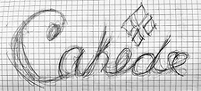
The first part of my process was dedicated to my logo. I could not have a brand without it, so it felt only necessary to begin with it. The Caked logo began as a typographic logo sketch with four diamonds and a heart on the end. The logo was then taken over to Illustrator. While the logo was heading in a good direction, I did not think that it was perfect yet. It was missing structure and a cohesive color palette. So for the next rendition, I based the logo and modified it off of Gelato Luxe from Adobe Fonts, and added a sparkle as the period of the name. My next and final rendition of the logo included deleting the period from the logo and adding a swoosh underneath for a sense of movement in the logo and I decided I wanted to make my logo a badge of honor. The brand is bold. It should be a brand makeup enthusiasts are extremely proud of wearing. The main logo is a badge-style logo to represent this. Then for my subordinate logo, I made it a typographic logo with the swoosh underneath it still, to tie back in the main logo. I also designed a variation of this logo to be used in the advertising campaign named Totally Caked!
Proccess


Final Logos


The Pallette
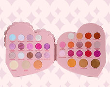
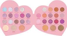
For my eyeshadow palette, I wanted a bold palette that was not only feminine but challenged the ‘less is more’ stance that a lot of modern graphic design shows. There is nothing wrong with minimalist graphic design. There is a reason it is super popular. Graphic design though, especially packaging can look absolutely beautiful when there is more visual to look at! When done well, more… can be more. That is where Frosting on Top comes in! Welcome to Frosting on Top! The palette’s graphics such as the frosting and cake elements were designed in procreate and the type was designed with a typeface Gelato Luxe and was modified for readability so it was more aesthetically pleasing for the viewer and brand. The graphics were brought into Illustrator to be turned into vectors. The subordinate type was a base of Rockwell that was then modified to look more like a type that you could see on a cake. Regulatory info and ingredients were set in Bogle. For the physical construction of the palette, I laser cut the palette and 3D frosting component (outside heart frosting), and then used vinyl to wrap the components.
Proccess

Final Palette


Lipstick & Foundation Box
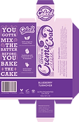
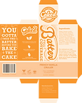
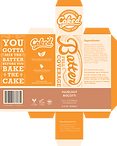
The lipstick box was designed (and subsequently everything else) in a way to compliment the palette. The box’s graphics were designed in Procreate and the type was designed with a typeface Gelato Luxe and was modified for readability so it was more aesthetically pleasing for the viewer and brand. The graphics were brought into Illustrator to be turned into vectors. The subordinate type was a base of Rockwell that was then modified to look more like a type that matched the brand better. Regulatory info and ingredients were set in Bogle. Creme Coat is the name of the lipstick line. It has 4 berry-baked–good-themed names for all of the products in this design. There is Berry Tart, Strawberry Pie, Blackberry Cobbler, and Blueberry Turnover. The batter is the name of the foundation. It has 4 different box variations for the project that show it can be readable in a variety of skin tones. This box is also where I developed the tagline “You gotta mix the batter before you bake the cake!” The accents around the type were designed to subtly look like the ripple in batter that you see after mixing it!
Product Photos


Flatlays



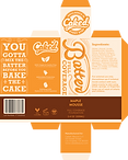
Lipstick & Foundation Tubes
Both the lipstick and foundation had accompanying tubes that were designed. The area is small and is to be designed in, but the area must be designed well. To accommodate this I decided that the product must sparkle! For that reason alone (besides the fact it looks amazing) I made the sparkles from the logo die cuts on the label. This way the viewer can still see the product but the brand is still highly recognizable. The tubes were designed with the logo placed vertically in the center, the name directly below that, set in the font Bogle, and the ML and oz in the same font below the name. Adorned on each side are the die-cut sparkles that will let the consumer see the actual product! I believe this allows the brand to be recognizable on the tube and still keep consistent with my branding!
Product Photos


Flatlays
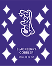


Setting Powder
Product Photos
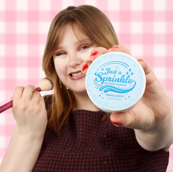
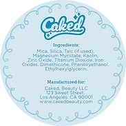
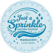
Last but not least the setting powder was designed also in a way to compliment the palette. Just a Sprinkle is the name of the setting powder. It is in the shade Translucent for the project. The powder does not come in a box but includes a wrap-around label, top label, and bottom label. The container's graphics were designed in Procreate and the type was designed with a typeface Gelato Luxe and was modified for readability so it was more aesthetically pleasing for the viewer and brand. The graphics were brought into Illustrator to be turned into vectors. The subordinate type was a base of Rockwell that was then modified to look more like a type that matched the brand better. Regulatory info and ingredients were set in Bogle.
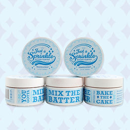
Flatlays

Instore Display & Billboard
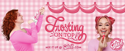
The in-store display was designed to feature the physical packaging of the project. This in-store display was originally a white stuffed animal display that I tore apart, spray painted, and built together again. The headpiece I laser cut to perfectly fit my logo on. The main section on the bottom I designed then had printed on a wide format printer due to its size. It is meant to have different graphics depending on where you are standing. The front showcases the typography from the Frosting on Top palette. The left-hand side has a model piping in the frosting in the display and on the right-hand side, I have a model putting on the product. I also reused the instore display for a billboard.
Product Photos

Flatlay/ Billboard

AD's & Microsite
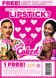
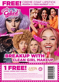
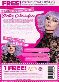
For the ads, I took inspiration from early 2000’s magazines. This was because these magazines had EVERYTHING. From breakups to quizzes, to days in the life of various celebrities. It was as if the magazines were clicking on the content for the viewer. Subsequently, the magazine ads took inspiration from this. Welcome to Totally Caked! On the ‘cover,’ you get to see the main title “Breakup with Clean Girl Makeup” with various people in makeup and sub-taglines as an early 2000’s magazine would have. The second ad was a magazine quiz that always leads down to the Caked logo because the consumer should want to be caked! The final ad was a ‘spend the day with Shelley Cakeserface’ which is an article-style ad that lets you know about our brand ambassador.
The microsite was the final component of the project. This component has a homepage, the bakery (shop page), about, and a find your recipe page which is an online quiz. The website is fully clickable and features all of the products and product photography. I also have model photos using the product.
AD's
